Widget Configuration
A widget is a powerful, self contained user interface component that plays a key role in the Loyalty customer journey. Loyalty widgets can be easily embedded into a company’s website or accessed directly through a dedicated URL, creating seamless and engaging experiences for customers.
Widget Configuration Topics
Registration / Enrolment Widget
The Registration / Enrolment widget collects customer details during the Loyalty Program sign up process. Each program has its own unique Registration / Enrolment widget URL link; however, the configuration is set at the company level, meaning all programs within the company share the same widget set up.
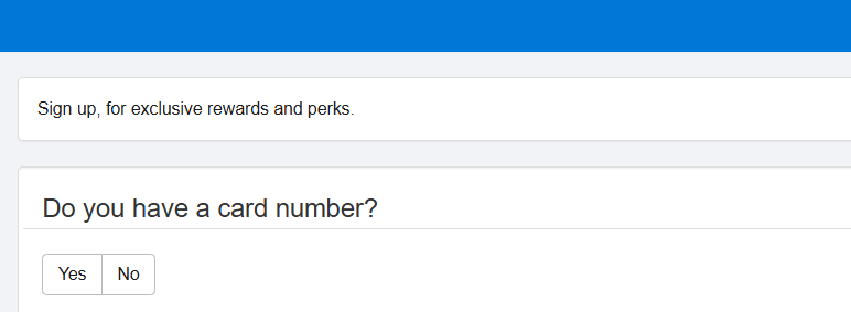
This widget supports two sign-up methods, each with its own configurable options. At the start of the sign-up journey the question "Do you have a card number?" is asked:
-
Yes = Registration: For customers who already have a Loyalty Card number and are registering their personal details to link with that card
-
No = Enrolment: For customers who do not yet have a Loyalty Card number. A card is allocated during the sign-up process from the Enrolment Card set
Configuration
Follow these steps to configure widgets:
-
From the top menu, select which Widget you want to configure: Registration or Enrolment
-
Click Edit
-
Configure the fields as required
-
Select Save
Display Options
The following configuration can be applied to the Registration and Enrolment Widget.
-
CSS Upload: Apply a CSS style sheet. Select Choose File, locate the CSS file on your device, and click Upload to apply it to the widget.
-
Image Upload: Add an image (such as a logo) to the widget, which will appear as a thumbnail in the top-right corner next to the Logo heading. In the Image Upload section, select Choose File.Locate and select the image file from your device. Click Upload to add the image to the widget.
The following free-text fields allows you personalise the widget by adding custom information:
| Field Name | Required | Description |
|---|---|---|
| Text | ✕ |
Displayed next to the Terms & Conditions link at the end of the journey |
| Header Text | ✓ |
Header at the top of the registration form displayed throughout the journey |
| Introduction Text | ✓ | Main content displayed below the header at the start of the registration form |
| Thank You Header | ✓ | Header displayed to customers after they successfully complete sign-up |
| Thank You Body | ✓ | Message shown beneath the Thank You Header at the end of the journey |
Data Protection Fields
All data protection fields are displayed on the final page, immediately before the guest completes the sign-up process.
| Field | Description |
|---|---|
| Terms & Conditions URL |
Enter the web address linking to your Terms & Conditions |
| Terms & Conditions URL Text |
Provide a title for the Terms & Conditions link. If left blank, it defaults to “Terms & Conditions |
| Privacy Statement URL |
Enter the web address linking to your Privacy Statement. If you prefer not to use a URL, leave this field blank and instead enter the full Privacy Statement text in the field below |
| Privacy Statement URL Text |
Provide a title for the Privacy Statement link. If left blank, it defaults to “Privacy Statement Link” |
| Privacy Statement |
If no Privacy Statement URL is provided, enter the full Privacy Statement text here to ensure it is displayed appropriately |
Marketing Consent Options
Each Marketing Consent Option includes a check box that determines whether it is available to customers in the Widget. If the check box is not selected, the option will not appear. Each option has default text in the Custom Text field, which can be edited as needed.
Email Opt-In | SMS Opt-In | SMS Opt-In |Push Opt-In |Phone Opt-In | Postal Opt-In
Registration Fields
Used to capture customer detail. Each field has a default title (shown under Property), or can be customised using the Alias field.
There are three mandatory fields that cannot be removed from the sign up journey:
FirstName | LastName | Email
Optional fields can be configured to be Visible and Required via tick box. Optional fields include:
-
Title
-
Occupation
-
BirthYear
-
BirthMonth
-
BirthDay – Important to capture if you plan to offer rewards based on a customer’s birthday
-
Gender
-
Address1
-
Address2
-
Address3
-
City
-
County
-
Postcode
-
Country
-
MobilePhone - Always visible
-
HomePhone
-
EmailConfirmation
-
CustomInput1 – Example: “Which site/pub do you visit the most?”. Custom fields can be valuable marketing tools when used effectively. Note this is a free text box not drop down.
-
CustomInput2
-
CustomInput3
-
CustomInput4
-
CustomInput5
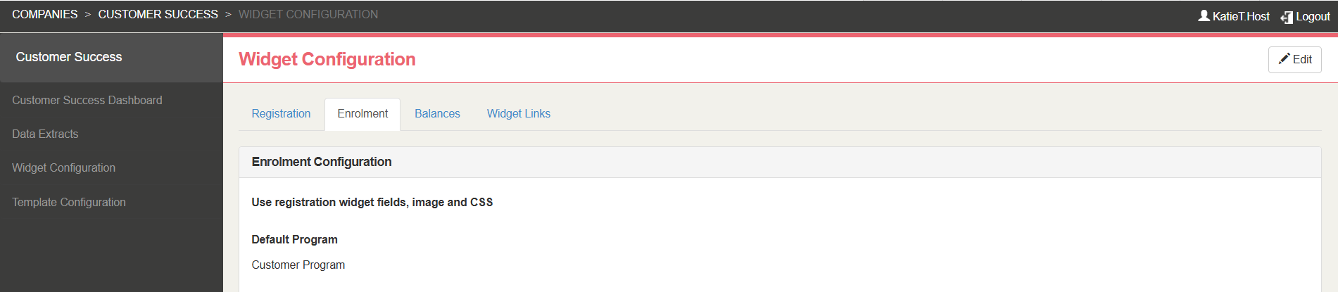
Enrolment Settings
The following configuration options are only available on the Enrolment widget tab:
-
Use Registration Widget Fields, Image, and CSS: Copies all settings from the Registration widget (fields, image, and CSS) to the Enrolment widget.
Default Program: When using Automatically Sign Up to Loyalty in the White Label App, this is the program the customer will enrol to.
Balance Widget
Customers that are signed up with your loyalty program(s) can check their current rewards or balance online using the Balance Widget. The same Balance Widget is used across all Loyalty programs within a company, even if multiple programs are in place.
To sign-in to the Balance Widget the customer needs to enter either their Email, CardNumber or MobilePhone along with their PIN. Customers are allocated a PIN when on sign-up, these can be distributed via the sign-up email.
Configuration
Follow these steps to configure the widgets:
-
From the top menu, select Balances
-
Click Edit
-
Configure the fields as required
-
Select Save on completion
Display Options
The following configuration options are able for the Balance Widget.
-
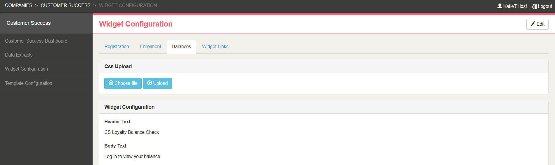
Css Upload: Apply a CSS style sheet. Select Choose File, locate the CSS file on your device, and click Upload to apply it to the widget.
-
Header and Body Text: Information displayed to customers on the Balance Widget on log in e (both fields are mandatory).
-
Display Loyalty Card QR Code: Display a digital QR Code of the Loyalty Card number in the Widget.
-
Display Add To Wallet Buttons: Allow for customers to added their digital Loyalty Card their Apple or Google Wallet.
Pass Creator must be configured for this functionality, for more information click here -
Identifier Order: The sequence of information prompts shown to customers, allowing them to choose how they identify themselves.
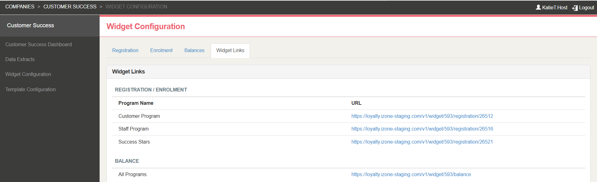
Widget Links
The Widget Links tab lists all URL for the Widgets available within the company. These links can be added to your website to provide customers with direct access to the relevant customer journeys.
Display, styling and field configuration applies to all widgets within the Company. Estate structure is set within Launchpad.