Edit Theme Settings
Edit Theme Settings Topics
Look and feel
Home
The home screen, where the venue banners are listed.
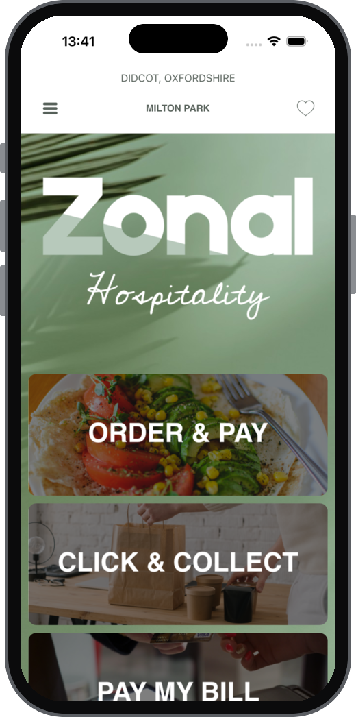
| Setting | What it does | Default | Notes |
|---|---|---|---|
| Display Header | Determines whether the home screen header should be shown for all sites. | On | |
| Display Footer | Determines whether the social network icons underneath the last banner should be shown for all sites. | On | |
| Vertical Spacing in Points | Determines the vertical space between each home screen banner for all sites. | 10 | 0 to 100 |
| Normal | Retina | Giraffe Home Background Image | A background image for the home screen only. Overrides the View background image on this screen | None | See Asset Guidelines for more information. |
| Corner Radius: Top Left | Top Right | Bottom Right | Bottom Left | Rounds the corners of every home screen banner | 0 | 0 to 50 for each corner |
Bar
The navigation bar at the top of each screen, where applicable.
| Setting | What it does | Default | Notes |
|---|---|---|---|
| Bar Tint Colour | Background colour of the navigation bar | 407286 | |
| Deprecated | |||
| Deprecated | |||
| Tint Colour | Colour of the buttons and icons in the navigation bar | FFFFFF | |
| Title Font, Title Font Offset, Title Text Transformation | Font of the screen title | Avenir-Black, 0, None | |
| Title Colour | Colour of the screen title | FFFFFF | |
| Navigation Font, Navigation Font Offset, Nav Text Transformation | Font of the navigation bar buttons | Avenir-Light, 0, None |
Button
Buttons throughout the app.
| Setting | What it does | Default | Notes |
|---|---|---|---|
| Normal Title Colour | Button text colour | 00000f | |
| Normal BG Colour | Button background colour | eeeeee | |
| Normal Font, Normal Font Offset, Text Transformation | Button text font | Avenir-Black, 0, None | |
| Selected Title Colour | Button text colour while the button is pressed | 00000f | |
| Selected BG Colour | Button background colour while the button is pressed | 0000ff | |
| Product Font, Product Font Offset, Text Transformation | Font used for product buttons | Avenir-Light, 0, None |
Table View
Lists in the app, including list headers, rows and the lines between rows.
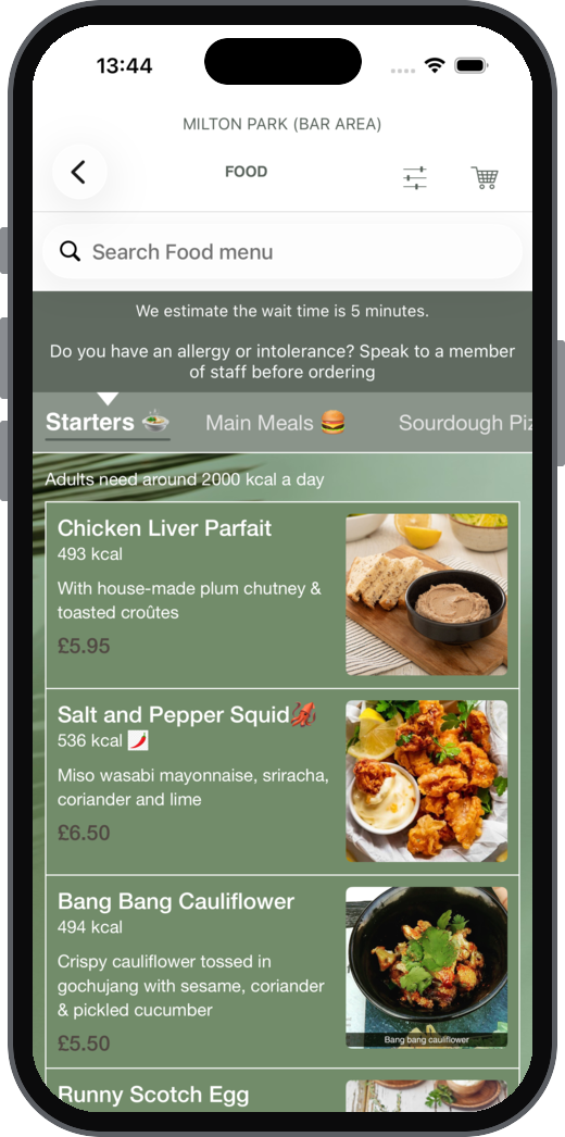
| Setting | What it does | Default | Notes |
|---|---|---|---|
| Header Font, Header Font Offset, Header Text Colour, Header Text Transformation | List section headers | Avenir-Black, 0, 666359, None | |
| Sub-header Font, Sub-header Font Offset, Sub-header Text Colour, Sub-header Text Transformation | List sub-headers | Avenir-Roman, 0, 999585, None | |
| Primary Font, Primary Font Offset, Primary Text Transformation | Main text in each row | Avenir-Light, 0, None | |
| Secondary Font, Secondary Font Offset, Sec. Text Transformation | Secondary text in each row | Avenir-Light, 0, None | |
| Detail Font, Detail Font Offset, Detail Text Transformation | Detail text in each row | Avenir-Light, 0, None | |
| Separator Colour | Colour of the line between rows | Blank | |
| Row Normal State: Row Background Colour, Primary | Secondary | Detail Text Colour | Row colours when a row isn't selected | e6e0c8, 4d4d4d | |
| Row Selected State: Row Background Colour, Primary | Secondary | Detail Text Colour | Row colours when a row is tapped | e6e0c8, 4d4d4d |
Rear Menu
The side menu that opens from the menu icon.
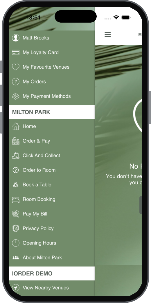
For the loyalty card entry see Viewing a Loyalty Card
| Setting | What it does | Default | Notes |
|---|---|---|---|
| User Sign Up Phrase | Text of the sign in entry | Sign In/Sign Up | |
| Show My Loyalty Card | Shows the loyalty card entry in the menu | On | |
| Loyalty Program Phrase | Name of the menu entry that leads to the guest's loyalty card number and other loyalty account information | My Loyalty Card | |
| Header BG Colour | Background colour of the menu header | FFFFFF | |
| Header Font, Header Font Offset, Header Text Colour, Header Text Transformation | Menu header text | Helvetica-Neue, 0, 000000, None | |
| Icon Tint Colour | Colour of the menu icons | c5ad85 | |
| Row Background Colour | Background colour of each menu entry | Transparent | |
| Row Font, Row Font Offset, Row Text Colour, Row Text Transformation | Menu entry text | Helvetica-Neue, 0, 000000, None | |
| View Background Colour | Background colour of the whole menu | FFFFFF | |
| Normal | Retina | Giraffe Background Image | Background image of the menu | None |
View
The default background and buttons for app screens. Other sections can override it on their own screens.
| Setting | What it does | Default | Notes |
|---|---|---|---|
| Normal | Retina | Giraffe Background Image | Default background image for app screens | None | |
| Main Background Colour | Default background colour for app screens | FFFFFF | |
| Normal Btn BG Colour | Button background colour | CA5B3F | Deprecated. Use Button section. |
| Normal Btn Title Colour | Button text colour | FFFFFF | Deprecated. Use Button section. |
| Selected Btn BG Colour | Button text colour while the button is pressed (see note) | ffffff | Deprecated. Use Button section. |
| Selected Btn Title Colour | Button background colour while the button is pressed (see note) | CA5B3F | Deprecated. Use Button section. |
| Row Font, Row Font Offset, Text Colour, Text Transformation | Row text | Helvetica-Neue, 0, 000000, None | Deprecated. Use Button section. |
| Full Screen Layout: Use Light Status Bar? | Shows the status bar in light text on full screen layouts, such as the sales area selector | Off | Deprecated |
| Full Screen Layout: Button Tint Colour | Colour of the buttons on full screen layouts | 000000 |
Notifications
The notification banner shown on menu and search screens, for example when an item is added to the basket.
| Setting | What it does | Default | Notes |
|---|---|---|---|
| Background Colour | Background colour of the banner | Blank | |
| Use Light Status Bar? | Shows the status bar in light text while the banner is showing | Off | Deprecated |
| Text Colour | Colour of the banner text | Blank | |
| Product Font, Product Font Offset, Product Text Transformation | Font of the product name in the banner | Avenir-Roman, 0, None | |
| Normal Font, Normal Font Offset, Normal Text Transformation | Font of the rest of the banner text | Avenir-Roman, 0, None |
Empty View
The placeholder image and text shown when a screen has nothing to show.
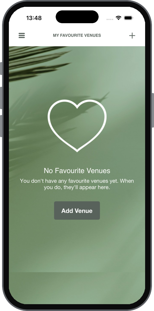
| Setting | What it does | Default | Notes |
|---|---|---|---|
| Image Tint Colour | Colour of the placeholder image | ffffff | |
| Primary Text: Font, Font Size, Text Colour, Text Transformation | The placeholder title | OpenSans-Regular, 2, ffffff, None | |
| Detail Text: Font, Font Size, Text Colour, Text Transformation | The placeholder detail text | OpenSans-Regular, 0, c5ad85, None |
Nearby Venues
The bar below the navigation bar that shows the guest's location.
| Setting | What it does | Default | Notes |
|---|---|---|---|
| Background Colour | Background colour of the bar | 007697 | |
| Near Text: Font, Font Size, Text Colour, Text Transformation | The "near" text | OpenSans-Light, 0, ffffff, None | |
| Location Text: Font, Font Size, Text Colour, Text Transformation | The location text | OpenSans-Regular, 0, ffffff, None |
Typography
Shared text styles for large titles and subtitles.
| Setting | What it does | Default | Notes |
|---|---|---|---|
| Large title: Font, Font Size, Text Colour, Text Transformation | Large titles | Helvetica-Bold, 0, 000000, None | |
| Subtitle Subject: Font, Font Size, Text Colour, Text Transformation | The subject part of a subtitle | Helvetica-Bold, 0, 000000, None | |
| Subtitle: Font, Font Size, Text Colour, Text Transformation | Subtitles | Helvetica, 0, 000000, None |
Card
The cards shown for sales areas.
| Setting | What it does | Default | Notes |
|---|---|---|---|
| Should Show Gradient | Shows a gradient over the card | On | |
| Gradient Tint Colour | Colour of the gradient | 000000 | |
| Icon Tint Colour | Colour of the card icon | ffffff | |
| Title Label: Font, Font Size, Text Colour, Text Transformation | The card title | Helvetica-Bold, 0, ffffff, None | |
| Subtitle Label: Font, Font Size, Text Colour, Text Transformation | The card subtitle | Helvetica, 0, d0cfce, None |
Wording
Global
Phrases used throughout the app, and the screen the app opens to.
| Setting | What it does | Default | Notes |
|---|---|---|---|
| Venue Phrase | The word used for a venue | Venue | |
| Open the App to | The screen guests see when they open the app: Nearest Venue, Favourite Venue, Nearby Venues or Browse All Venues | Nearest Venue | |
| Supports Menu Filtering | Lets guests filter menus | On | See Calories |
| Deprecated | |||
| Table Phrase | The word used for a table | Table | Used wherever {tablePhrase} appears |
| Table Requires Phrase | Text shown when guests need to be sat at a table | Requires you to be sat at a table | |
| Sales Area Phrase | The word used for a sales area | Area | |
| Venue Sales Area Format | How the venue and sales area are shown together | $siteName$ ($salesAreaName$) | |
| Hotel Phrase | Room Phrase | Folio Phrase | The words used for a hotel, a hotel room and a hotel folio | Hotel | Room | Folio | Room Phrase is used wherever $roomPhrase$ appears |
Loyalty Card
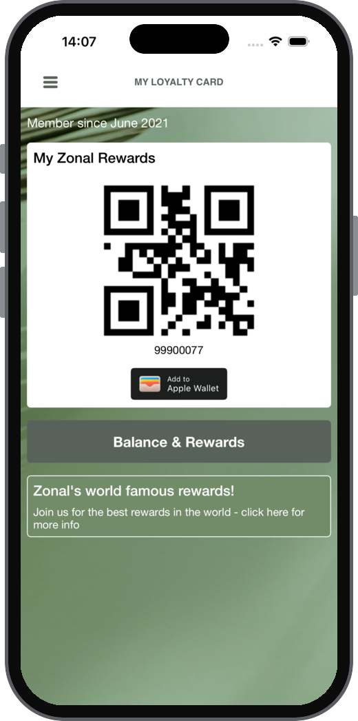
The My Loyalty Card, Add Loyalty Card and Remove Loyalty Card screens.
| Setting | What it does | Default | Notes |
|---|---|---|---|
| Loyalty Card Phrase | The name used for the loyalty card | Loyalty Card | Used wherever $loyaltyCardPhrase$ appears |
| Article Loyalty Card Phrase | The word placed before the loyalty card phrase | a $loyaltyCardPhrase$ | |
| View Account Btn | Text of the view account button | View My Account | |
| View Balance Btn | Text of the view balance button | View My Balance | |
| Name Label: Font, Font Size, Text Colour, Text Transformation | The card holder's name on the card | OpenSans-Regular, 2, ffffff, None | |
| Number Label: Font, Font Size, Text Colour, Text Transformation | The card number on the card | OpenSans-Regular, 2, cdb996, Uppercase | |
| Prompt For Association | Asks guests to add a loyalty card after they sign up | Off | See Associating a Loyalty Card |
| Can Associate Loyalty Card | Lets guests add a loyalty card later from the My Loyalty Card screen | Off | |
| Can Disassociate Loyalty Card | Lets guests remove a loyalty card from the My Loyalty Card screen | Off | See Disconnecting a Loyalty Card |
| Add Loyalty Card Image | Image on the Add Loyalty Card screen | None | Image URL must use https |
| Add Loyalty Card Title | Title of the Add Loyalty Card screen | Do you have a $loyaltyCardPhrase$? | |
| Add Loyalty Card Description | Description on the Add Loyalty Card screen | Would you like to add your $loyaltyCardPhrase$? | |
| Add Loyalty Card Button Title | Button on the Add Loyalty Card screen | Add $loyaltyCardPhrase$ | |
| Remove Loyalty Card Description | Description on the Remove Loyalty Card screen | Would you like to remove your $loyaltyCardPhrase$? | |
| Loyalty Reward Phrase | The name used for a loyalty reward | Reward | Used wherever $loyaltyRewardPhrase$ appears |
| Show Add to Wallet Button: iPhone OS | Android | Shows a button to add the loyalty card to the phone's wallet | Off | Only turn on if a pass has been set up in Pass Creator and Loyalty |
Loyalty Balance
The loyalty balance shown to guests.
See Viewing Balances & Rewards
| Setting | What it does | Default | Notes |
|---|---|---|---|
| Supports Loyalty Redemption | Lets guests redeem supported iZone Loyalty rewards in the app | Off | |
| Show Loyalty Balance | Shows the guest's loyalty balance | Off | |
| Show Loyalty Points | Shows the guest's loyalty points | Off | |
| Loyalty Points Phrase | The word used for loyalty points | Points |
Loyalty Rewards
The rewards screen, the basket and the link loyalty screen.
See Redeeming a Reward or a Currency Amount
| Setting | What it does | Default | Notes |
|---|---|---|---|
| Rewards Title Text | Title of the rewards screen, and of the rewards button in the basket | Add $loyaltyRewardPhrase$ | |
| Site Availability Title | Title shown above the rewards available at the venue | Add to basket | |
| Site Availability Phrase | Text shown with venue specific rewards | The following $loyaltyRewardPhrase$s can be redeemed at $siteName$ in $siteTown$. | |
| Currency Redemption Title | Description | Button | Wording for redeeming a currency balance | Blank | |
| Currency Redemption T&C's URL | Link to the terms and conditions for currency redemption | Blank | Must use https, 12 to 2048 characters |
| Rewards Button Text | Text of the button against each reward | Add $loyaltyRewardPhrase$ | |
| Site Availability Till Only Title | Shown against rewards that can only be redeemed at the till | Available at till only | |
| Basket Reward Indicator Style | How a reward in the basket is marked: Bookmark or Inline | Bookmark | |
| Link Loyalty Title | Link Loyalty Button Text | Link Loyalty Supporting Text | Wording on the link loyalty screen | Verify your $loyaltyCardPhrase$ | Verify | Blank | |
| Show Reset PIN Option? | Shows the option to reset a loyalty PIN | No |
Ordering and payment
Ordering
The menu, ordering and checkout screens, and the sales area selector.
| Setting | What it does | Default | Notes |
|---|---|---|---|
| Enable Skip menu selection | Takes guests straight to the menu when only one menu is available, for the selected order modes | Off | Tick at least one order mode |
| Display ABV% in Menus | Shows ABV% values set up in Aztec on app menus | Off | |
| Background Colour | Background colour of the horizontal scroll menu | ffffff | |
| Horizontal Scroll Menu Normal: Font, Font Size, Text Colour, Text Transformation | The category tabs across the top of the menu | Helvetica, 0, 000000, None | |
| Horizontal Scroll Menu Selected: Font, Font Size, Text Colour, Indicator Colour, Text Transformation | The selected category tab and the line under it | Helvetica, 1, ffffff, 1f5259, None | |
| Guest Checkout Enabled? | Lets guests order without an account | No | |
| Guest Checkout Phrase | Text shown to guests checking out without an account | Your email address will be used to send you an order confirmation. | |
| Vaulted Payment Phrase | Text shown with the option to save card details | Securely save your card details for future use. | |
| Share My Order Text | Text used when a guest shares their order | I've just placed an order at $VENUENAME$ using the app! | |
| Supports Tip | Lets guests add a tip, for the order modes ticked under Apply to Order Modes | Off | Tick at least one order mode. If none were saved before, every order mode is ticked when Supports Tip is selected |
| Tip Button Text | Tip Supporting Text | Wording for adding a tip | Add a tip | Tips are divided equally | |
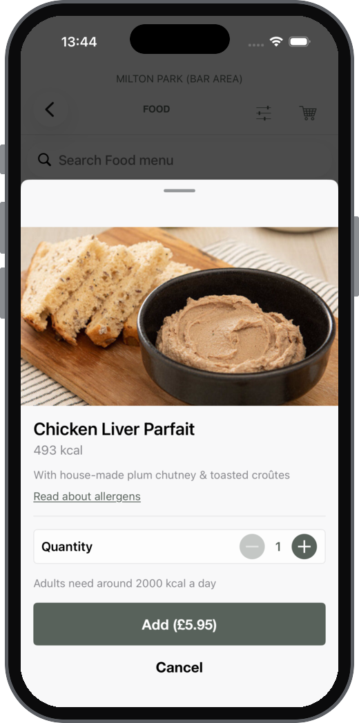
| Show Allergens Button | Shows an allergens button that opens the allergens page | No | See External Links |
| Missing Allergens Message | Shown when no allergens information is available | Unable to find allergens information | |
| Allergens Title | Text of the allergens button | Read about allergens | |
| Carvery Message | Message shown for carvery items | Blank | |
| Supports In Menu Reordering | Lets guests reorder from inside a menu | On | |
| In Menu Reordering Phrase | Name of the reorder group in the menu | Order again | |
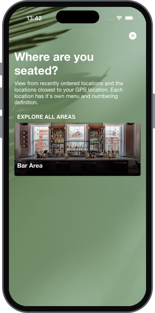
| Sales Area Selector: At Table Headline | Subtitle | Wording on the sales area selector for Order & Pay and Pay My Bill | Where are you seated? | Let us know where in $siteName$ you would like to order. | |
| Sales Area Selector: Click & Collect Headline | Subtitle | Wording on the sales area selector for Click & Collect | Where are you collecting from? | Let us know where in $siteName$ you would like to order. | |
| Sales Area Selector: Delivery To Location Headline | Subtitle | Wording on the sales area selector for Delivery to Location | Where would you like to order from? | Let us know where in $siteName$ you would like to order. |
My Orders Screen
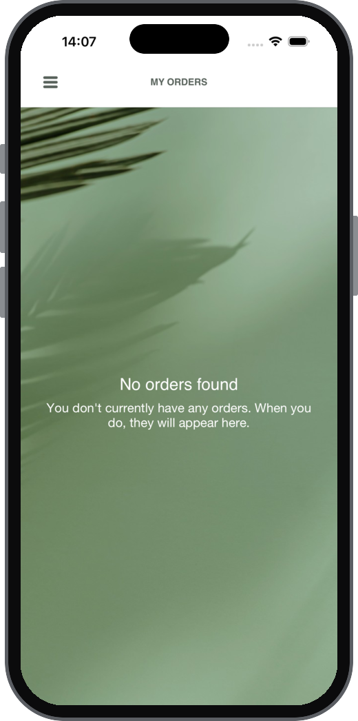
The My Orders screen.
| Setting | What it does | Default | Notes |
|---|---|---|---|
| Enable Split by PayPal? | Shows the option to split the bill with PayPal | No | |
| Button Text | Text of the split button | Split by PayPal | |
| Description | Text shown with the split button | Split the bill with PayPal |
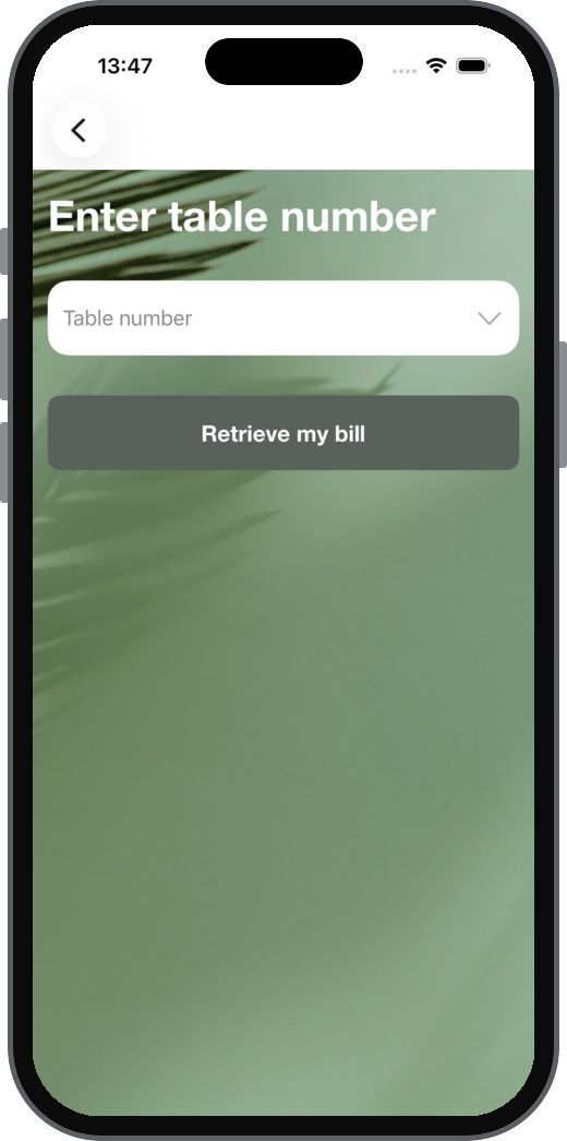
Pay My Bill
The Pay My Bill screens.
| Setting | What it does | Default | Notes |
|---|---|---|---|
| Pay My Bill Selector Text | Prompt for the table number | Enter {tablePhrase} number | |
| Pay My Bill Balance Text | Total Text | Labels for the balance and total | Balance | Total | |
| Pay My Bill Button Text | Text of the button that finds the bill | Retrieve my bill | |
| Pay My Bill Enter Table Placeholder | Placeholder in the table number box | {tablePhrase} number | |
| Service Charge Removal Text | Tells guests what to do if they want the service charge removed | Please speak to a member of staff if you would like to remove your service charge | Optional, up to 250 characters |
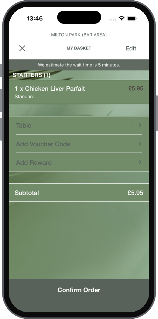
Basket
The basket screen.
| Setting | What it does | Default | Notes |
|---|---|---|---|
| Confirm Order Button Text | Text of the button that places the order | Confirm Order | |
| Deprecated | |||
| Forfeit Amount Phrase | Warning shown when a voucher is worth more than the qualifying items | The value of the voucher(s) exceeds the value of the qualifying item(s) in your basket. You may lose {forfeitAmount} if you complete this order. |
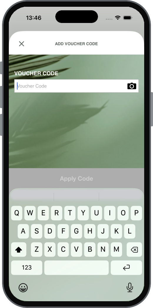
Vouchering
The voucher entry in the basket.
| Setting | What it does | Default | Notes |
|---|---|---|---|
| Supports Vouchers | Lets guests enter voucher codes | No | Saving the General/App tab also sets vouchers for Web Ordering to match, on or off |
| Call To Action Text | Text of the button that opens voucher entry | Add Voucher Code | |
| Supporting Text | Text shown with the voucher box | Blank | |
| Apply Button Text | Text of the apply button | Apply Code | |
| Input Label Text | Input Placeholder Text | Label and placeholder for the voucher box | Voucher Code |
Hotel Charging
The payment sheet, room selector and folio selector when charging to a room.
| Setting | What it does | Default | Notes |
|---|---|---|---|
| Button Title | Button on the payment sheet | Charge to $roomPhrase$ | |
| Should Prefix Room Phrase | Puts the room phrase before the room name or number | On | |
| Room Selector: Title | Sub Title | Title and subtitle of the room selector | Which $roomPhrase$ are you staying in? | Let us know which $roomPhrase$ in $siteName$ you are staying in. | |
| Room Selector: Guest Name Phrase | Room Number Phrase | Labels for the guest name and room number | Guest Name | $roomPhrase$ Number | |
| Room Selector: Button Title | Button on the room selector | Find my $roomPhrase$ | |
| Room Selector: Supporting Text | Text shown on the room selector | Blank | |
| Folio Selector: Supporting Text | Text shown on the folio selector | Blank | |
| Folio Selector: Show Folio Balance | Shows the balance against each folio | Off |
Gift Cards
The basket and the redeem gift card screen.
See Gift Cards Setup and Loyalty Integration Setup
| Setting | What it does | Default | Notes |
|---|---|---|---|
| Supports Gift Card Redemption | Lets guests redeem gift cards | Off | Locked, and the other settings in this section hidden, until Supports Gift Card is turned on in App Manager > Loyalty Integration |
| Card Phrase | The name used for a gift card | Gift Card | Used wherever $giftCardPhrase$ appears |
| Call to Action Title | Button in the basket for redeeming a gift card | Add $giftCardPhrase$ | |
| Redeem Button Title | Button on the redeem gift card screen | Redeem $giftCardPhrase$ | |
| Redeem Supporting Text | Text on the redeem gift card screen | Blank | |
| Redeem Card Image | Image on the redeem gift card screen | None | Image URL must use https |
Delivery to Location
The basket when using Delivery to Location.
| Setting | What it does | Default | Notes |
|---|---|---|---|
| Delivery Time Phrase | Label for the delivery time | Delivery Time | |
| Order Information Phrase | Label for the order information option | Order Information |
Additional Information - Delivery to Location
The additional information screen when using Delivery to Location.
| Setting | What it does | Default | Notes |
|---|---|---|---|
| Headline | Headline of the screen | Where can we find you? | |
| Subtitle | Subtitle of the screen | Let us know where we need to deliver your order to. | |
| Supporting Text | Extra text on the screen | Blank | Optional |
App behaviour and compliance
Minimum Age
The message shown when a guest adds an age restricted product.
See Minimum Age
| Setting | What it does | Default | Notes |
|---|---|---|---|
| Background Colour | Background colour of the message | 000000 | |
| Text Colour | Colour of the message text | ffffff | |
| Phrase | The message | By adding this product, you are agreeing that you were born on or before $DATEOFBIRTH$. Proof of age may be required. |
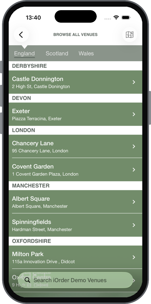
Browse Venues
The venue list.
| Setting | What it does | Default | Notes |
|---|---|---|---|
| Minimal Search | Moves the search box from the top of the venue list into the navigation bar | No | |
| Use Visual Display Style | Shows each venue's image as the background of its row | No | |
| Venue Thumbnail Border Colour | Border colour of venue images | 000000 | |
| Use Grouping | Groups the venue list | Yes | |
| Group By | Groups venues by County or Town | County | |
| Show Coming Soon First | Lists venues that are coming soon first | Yes | |
| Show Country Selector | Lets guests pick a country | No |
Native Login Form
The app's sign in and sign up screen.
| Setting | What it does | Default | Notes |
|---|---|---|---|
| Use Web Based Form | Uses a web based sign in form instead of the app's own screen | No | |
| Background Colour | Background colour of the screen | ffffff | |
| Background Image | Header Image | Images on the sign in screen | None | Image URLs must use https |
| Login Button Text | Text of the sign in button | Sign In | |
| Sign Up Button Text | Text of the sign up button | Sign Up | |
| Forgot Password Button Text | Text of the forgotten password button | Forgotten Password? | |
| Reset Password Button Text | Text of the reset password button | Reset Password | |
| Continue as Guest Text | Text of the option to continue without signing in | Continue as Guest | |
| Caption Colour | Colour of the caption text | aaaaaaa | The default isn't a valid colour. Enter a 6 character colour |
Account Deletion
The screens shown when a guest deletes their account.
| Setting | What it does | Default | Notes |
|---|---|---|---|
| Prompt: Supporting text | Shown before the guest confirms the deletion | This will disable your ordering account. You will no longer be able to sign in and place orders using your existing account details. | |
| Confirmation: Title | Title shown once the request is accepted | Your account deletion request has been accepted | |
| Confirmation: Supporting text | Text shown once the request is accepted | Explains that the data controller will be told and deletion completes within 30 days, and that linked accounts such as loyalty stay active |
Calories
Menus and the quantity selector.
See Calories
| Setting | What it does | Default | Notes |
|---|---|---|---|
| Calorie Allowance Phrase | The statement of daily calorie needs | Adults need around 2000 kcal a day | Up to 412 characters. If filled in, it always shows in the quantity selector |
| Show Calorie Allowance Phrase | Shows the statement on menus | On | Only affects menus |
App upgrades
The messages shown when a new app version is available.
See App Releases
| Setting | What it does | Default | Notes |
|---|---|---|---|
| Phrase enforcing to update | Shown when guests must install a newer version | New version available | Required, up to 100 characters |
| Phrase encouraging to update | Shown when a newer version is recommended | New version available | Required, up to 100 characters |
Allergen Prompt
A prompt shown whenever a guest selects a menu. The guest has to dismiss it to carry on ordering.
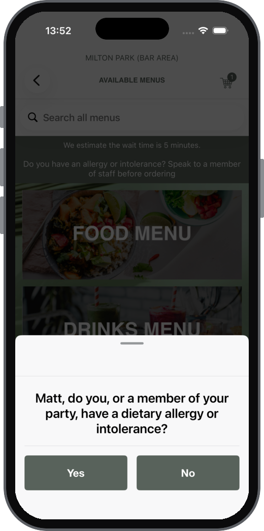
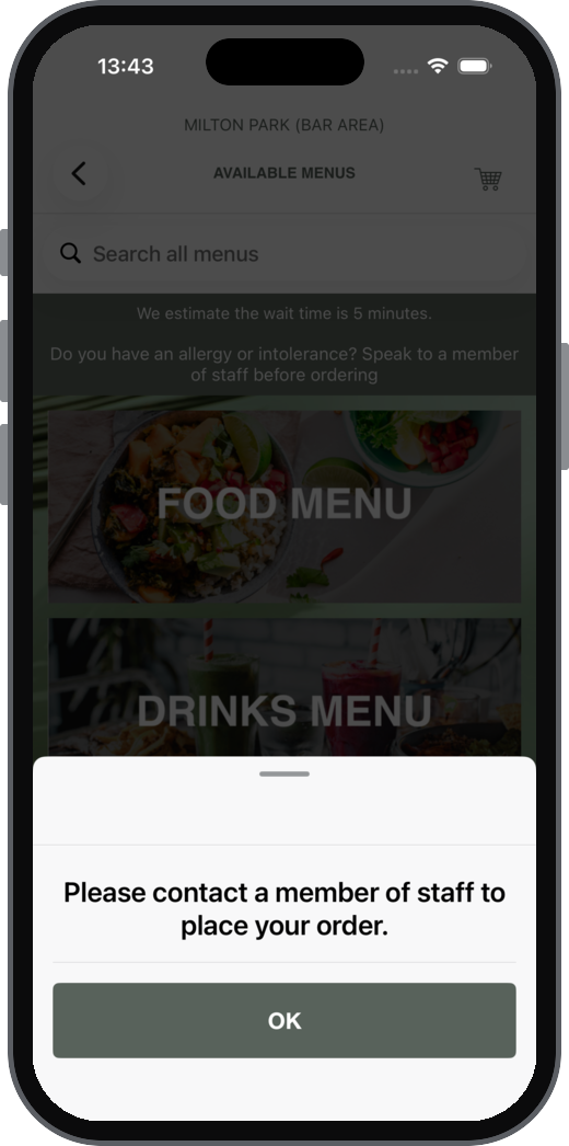
See Allergen Prompt
| Setting | What it does | Default | Notes |
|---|---|---|---|
| Show allergen prompt | Turns the prompt on | Off | |
| Instructions | Instructions shown when a guest confirms they have allergies, one text box per order mode | Blank | Required for every order mode when the prompt is on, up to 250 characters |
Allergens Banner
A banner at the top of each menu. If an allergens page is set up, the banner links to it.
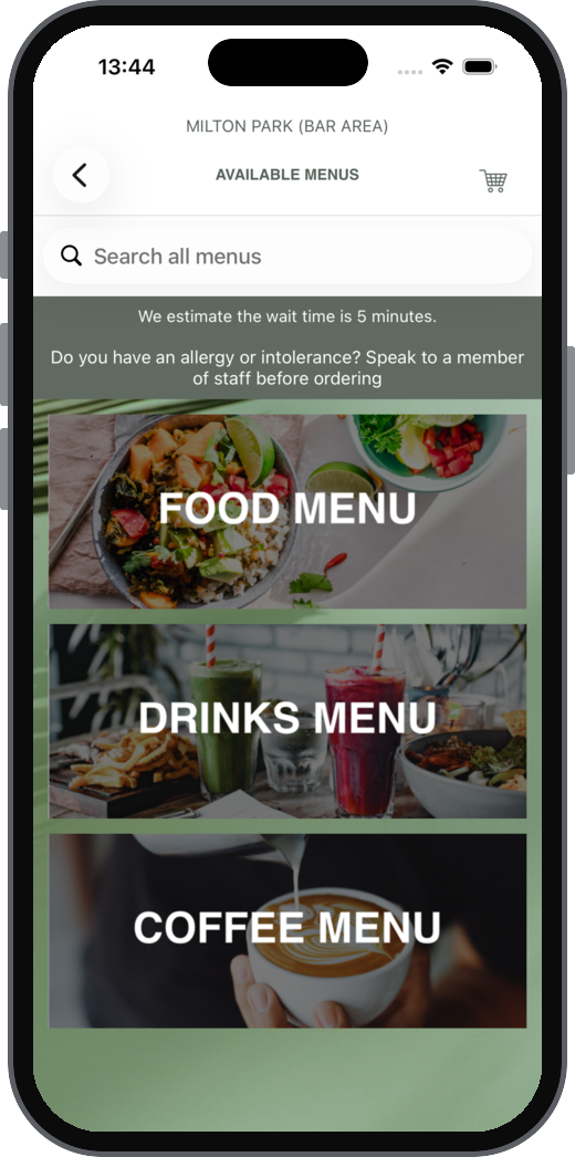
| Setting | What it does | Default | Notes |
|---|---|---|---|
| Show Allergens Banner | Turns the banner on | Off | |
| Banner Text | The banner text, one text box per order mode | Blank | Required for every order mode when the banner is on, up to 250 characters |
| Background Colour | Background colour of the banner | FFFFFF | No Transparent option |
| Primary Text Colour | Colour of the banner text | 000000 | No Transparent option |